The three main ways to produce graphs in R – Data Visualization in R
Data Visualization in R
If you are performing statistical analysis, data visualization is an inherent part of it. There is no quality data analysis software without visualization tools. We all know Microsoft Excel and we also know those pie and bar charts we can create quite easily with Excel.
If somebody without any analysis background asks me, what R is, I refer to it as open source, high end Excel with some first class graphical capabilities.
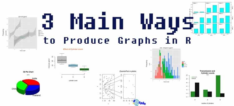
Those graphical capabilities are mainly part of the three graphical systems R has to offer: Base, Ggplot2 and Lattice. Those tools overlap at some points but can be seen as somehow separate systems.
In the following lines I will explain to you what those three main systems are and how you can best benefit from each of those. You will also see some examples to quickly recognize which system was used for a certain graph in R.
1. R Base:
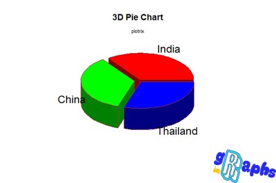
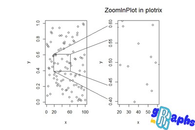
This system comes automatically attached when you download R. It is as old as R itself and is part of the standard learning process of R. Every basic R course you take or every introductory R book you read contains some base graphs plotting. Colour palette, line types, size magnification, headers, etc. are manipulated bit by bit. If you know the according parameter you can change nearly any single element in your plot like legends. This is a fairly simplistic system but still works quite well and is still widely in use. I would highly recommend to get a solid understanding of Base graphs in R since many of the parameters are also used in Lattice.
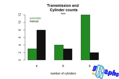
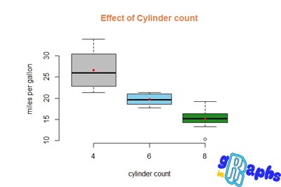
Furthermore, there is an array of add on packages like Plotrix which can offer some unique extra capabilities like 3D plotting. Those add on packages can be used quite easily once you know how to control Base plots.
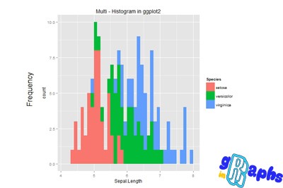
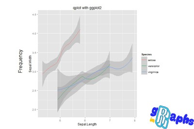
2. Ggplot 2:
The second system is called ggplot 2. It was created by Hadley Wickham and is based on the “Grammar of Graphics” by Wilkinson. The approach of this package is totally different to R Base. It is more a ready-made solution with 2 basic commands: ggplot and qplot. To each of those commands you can add layers. Features of the graphs are called aesthetics and need to be specified separately.
If you come from R Base, it takes some time to learn this totally new system since there are nearly no overlaps. There is a steep learning curve. However, this learning curve totally is worth the effort since the graphical layout of the graphs is superior to the Base layout. Ggplot 2 is increasingly getting the graphical system of choice for advanced R users.
In my “Graphs in R” course I included a separate section only on ggplot 2. Since this system is quite new I recommend to take a look at this course since structured learning material for this system is quite hard to find.
3. Lattice:
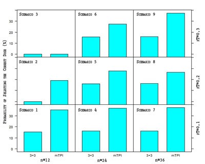
Lattice is slightly similar to R Base and thus easier to learn than ggplot 2. Within some limitations it is possible to add parameters on a bit by bit basis. Lattice is a must for scientists! When I read scientific publications with statistical analysis in it, lattice is used quite often. Lattice has one unbeaten advantage over all the other systems: it is easy to create multi-window or multi-panel plots like the one below. With this kind of multiple plots on one sheet it is easy to compare different settings. Let’s assume you want to graphically compare 2 different percentage/probability values of several populations. You can easily do that by using lattice.
Lattice plot with Photoshop fine-tuning
What I see quite often in the highest quality plots is a fine polishing of the R plots with Photoshop. If you want to add some logo or special effects to your plots, Photoshop is the way to do that. R offers all the data analysis precision while Photoshop is still the software of choice if you want to produce some highly aesthetic charts. Photoshop is also perfect for combining several different plots into one giant infograph.
R is definitely a powerful graphics and data visualization tool. It is highly recommended that you know how to work with the 3 main graphical systems it offers. Each system has its pros and cons and by knowing each of them you can take the best of each worlds. Furthermore, Photoshop can be a great help in fine polishing the chart or even combining it into infographs.