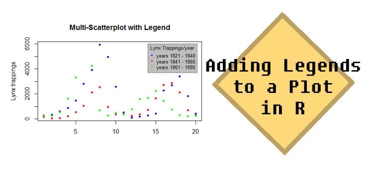
Adding Legends to a Plot in R
Legends are a very useful tool to bring more clarity to your R plot. If you take multi-layered scatter plots or histograms, proper legends allow the audience to understand your plot within seconds.
First of all, let us determine the difference between a legend and a table.
- Legends have the sole purpose to make your graph understandable. They are not intended to give any extra information to the graph and should be as intuitive as possible.
- Tables on the other hand can add extra information to your plot. For example counts or numbers on subcategories can be shown with added tables. If you take a look at library plotrix, function addtable2plot includes tables in your plot.
In this post however I want to focus on legends.
The general idea is to draw your graph first. You can take a look at the plot to decide where the best location for your legend would be. If you found the best spot, you use the command legend to start drawing the legend.
Let us create a multi-layered scatter plot to illustrate this topic.
First we need some numbers to work with. In this case I decided to take three blocks of length 20 from the dataset lynx, which is in the dataset base package.
? lynx
x = lynx[1:20]

y = lynx[21:40]

z = lynx[41:60]
We now have objects x, y, z. (Each of those objects contains the lynx trappings of 20 years.)
The next thing we do is creating the plot. Since I want the plot to be consisting of 3 layers I need to add y and z by using the points command.
plot(x, main = "Multi-Scatterplot with Legend",

col="blue", pch=20, xlab="", ylab="Lynx trappings", bty="o")
points(y, pch=20, col="red")

points(z, pch=20, col="green")
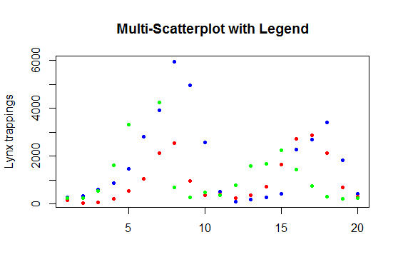
As you can see we have now 20 points for each object. On the y axis the trapping counts are shown and the x axis indicates the index number within the corresponding object. This can be a bit misleading but I decided to show it that way and let the legend do the clarification work.
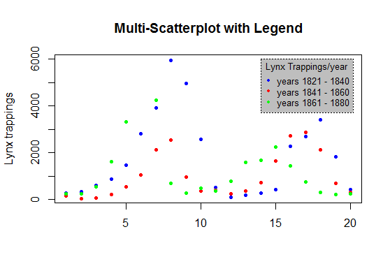
We do not yet know which colour represents which object. And this is where the legend comes in handy. It will explain the audience how to view this graph.
legend(14,6000,cex=0.8,
col=c("blue", "red", "green"),
pch=20,
title="Lynx Trappings/year",
legend=c("years 1821 - 1840", "years 1841 - 1860", "years 1861 – 1880"), bg="grey", box.lty=3, bty="o")
By viewing the graph without legend I figured that x = 14, and y = 6000 would be a nice place for my legend. Please note that finding out the proper position takes some time and readjustment is needed!
The first 2 values in your legend command should be the x and y coordinates. Than you can add the magnification factor cex to adjust the size of the legend. Colour (col) and points (pch) need to exactly resemble the pattern and order in the plot. By using the argument bty you can adjust the box type, type n would be no box surrounding. Legend specifies the text you want to show in your legend, order matters!
If you take a look at the legend help function you will discover that there are plenty of arguments to fine tune your work. Bg can be used to modify background coloration. Box.lty, box.lwd, box.col can be used to alter the box shape. Title can be used to add a title to your legend and with title.col and title.adj you can later on fine adjust it.
Adding legends to your R graphs is not hard at all and will help your audience get a quicker grasp of your material. R offers many functions to bit by bit tailor your legends. Make sure that you always plot the graph first and see where the best place for the legend could be. Use the same specifications for colour and points for your legend and you will get a perfect R graph.